Introducing Planning View in Tactyc
Our next major Tactyc release is Planning View — a “simple” 1 page that lets GPs plan and manage follow-on reserves for future rounds. It’s also a great example of how we think about product design.
Firstly, a bit about how we think about features.
Tactyc is not an app that does “just one thing”. In fact it combines multiple complex use cases into a single cohesive app:
Best-in-class fund projection model (for portfolio construction)
An investment calculator that can calculate dilutions, FMV, return the funds etc. based on investment rounds.
A portfolio manager that includes requesting and tracking company KPIs, qualitative metrics, dashboards and reporting
A fund reporting module, document center and cap table calculator.
All of the above can be individual apps on their own — but by combining all of them into a single cohesive interface we give our users (i.e. GPs) a powerful solution to analyze, forecast and manage their fund data from a single platform.
Given the complexity, we’re constantly trying to balance features that (a) increase the value prop of the platform, (b) make it easier to maintain the platform and (c) keeping the platform intuitive and easy to follow for a new user.
The last point is critical to us.
We don’t want to build the most flexible VC software ever — only for it to require a massive training manual to even get started. We also understand that if we attempt to please every single user, we’ll end up pleasing no-one.
To that end, we are very deliberate and careful about how we present Tactyc to end users in a way that reduces cognitive workload while also maintaining flexibility.
With that out of the way here’s a look at the upcoming Planning View.
The Problem.
Up until today, if a user wanted to add or change follow-on reserves for a deal in Tactyc, they would need to:
Open the investment
Edit the future round of that investment
Enter or change the investment amount in the future round.
This would automatically capture the future investment as a “follow-on reserve” for the deal. Seems easy enough? Not really.
Every future round in Tactyc has an associated graduation rate (i.e. the probability the company successfully makes it to the next round) — and the follow-on reserves allocated are weighted by this graduation rate.
User may want to also change future round sizes and round valuations if they believe their earlier round assumptions are no longer valid.
User may have defined multiple performance cases (for e.g. a Base Case and a Downside case) and the amount of reserves in each case might be different.
This means the user may potentially have to change 3 to 5 datapoints for each performance case of an investment. If they have to do this for 50 investments (each with 3 performance cases), that is 400–500 updates in the app. Combining them with every single click on an “OK” or “Save”, we are talking about 600–700 clicks.
The user will simply give up.
We needed to find an easier way to enable users to maintain and change their investment’s reserve projections for multiple investments at once.
The Solution
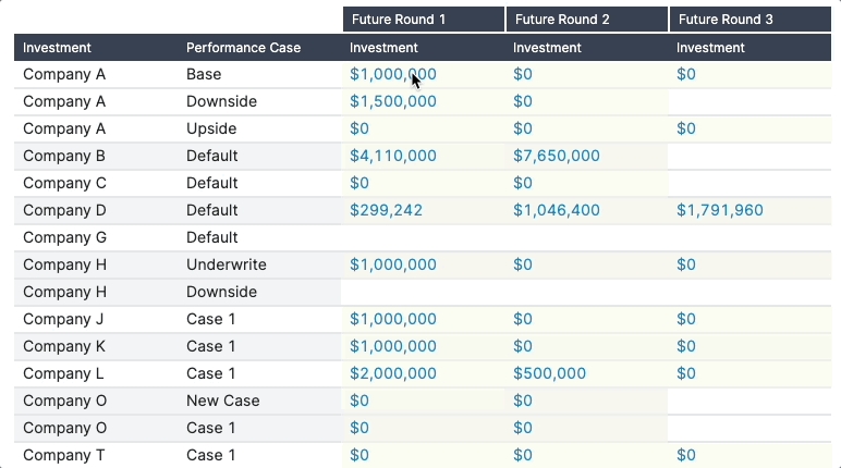
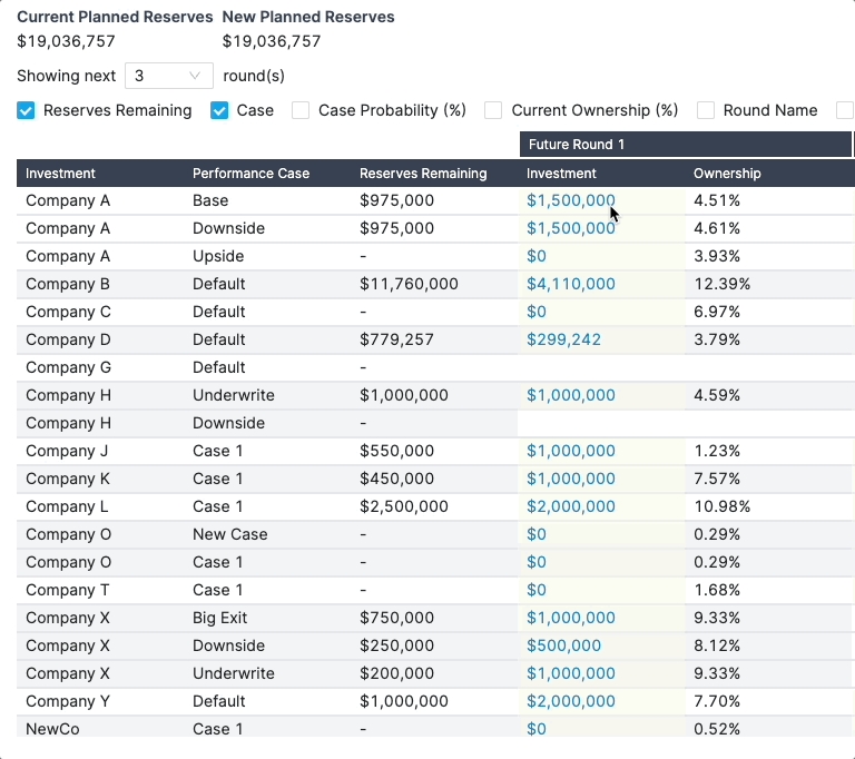
To solve this, we went back to first principles — what would be the simplest way for users to update massive amounts of data? The answer was to go back to a spreadsheet-like grid view. A one page grid view that shows reserve assumptions for every single performance case and lets users edit all the reserves — in a single view. We’ve just saved 300 clicks.

Next, we made this grid flexible. If a user wants to change just reserves, or graduation rates, or round sizes, they can set the appropriate filters for the grid to show only the data elements the user wants to change. That’s another 200 clicks saved.

Finally, we want to give the user information on the impact of these changes. What would be the dilution after each round? What would be the total reserves remaining after all our changes? We summarize ownerships and total reserves remaining to help users see the impact of their changes.

It’s all about context
The Planning View is a powerful feature that enables massive and wholesale changes to the fund model while also removing friction associated with updating each investment manually.
We’ve reduced the number of clicks needed to update reserves by about 5–7x.
Users can change graduation rates, reserves, future round sizes and valuations, probability of performance cases — all from a single 1 page view.
We’ve solved this by empowering users to setup a context — do you want to just update graduation rates? Just set the filer to graduation rates and we’ll hide away all the other extraneous data.
By removing data that the user does not need to see, and only presenting them actionable elements we reduce the cognitive load of the app, while also maintaining the flexible nature of the Planning View.
For a complex app such as Tactyc, context is key. If we show the user every single data point associated with an investment — the app would simply become unusable.
Closing Thoughts
The Planning View also emphasizes the focus we place on making it easy for users to maintain and update their fund data. This is critical to us. It increases time spent, makes the app experience more friendly and flexible and the Tactyc results much more actionable for our users.
Going forward, you’ll see many more product updates on features that help users quickly maintain and update data.
As always, we’d love to hear from you, so feel free to drop a note at [email protected] if you have any suggestions or feedback.
By Tactyc on November 28, 2022.
Last updated